1003: Frankenstein

I created a rendered design and turnaround for my new Frankenstein design.

In my previous 1003 post I mentioned creating a character that looked shattered and had mineral deposits growing out of it. I also wanted to use the thin and stretched body shape I liked, along with the head shape from Frankenweenie.

Here is the coloured version below-

1purplegolem1

I decided to make the skin a mixture of brown and purple to make it look like old clay, along with having darker brown near the stalactites.

I made them blue and yellow as it stood out more against the skin and is also the colour I’m best at drawing the illusion of light with.

I matched the facial features to the golems I’ve seen online, as well as giving it the belt and words I’ve seen all the statues have.

Here is the turnaround with and without the crystal structures-

In an analytical sense Frankenstein’s story is a story of a golem as he is bought to life out of materials and given tasks, but I’ve tied this design to golems even more by having the word on his forehead. In Jewish folklore the golem stops working if the word is erased, but by only having it half gone ties to the imagery of Frankenstein not working and decaying.

I haven’t decided on posture yet as these images were for the physical design only.

1001: Bouncing ball with perspective

At the start of the 2D animation lesson we looked at moving a bouncing ball on a 3D perspective. This task was set to help us with the idea of moving the Olympic figures on a “third dimension” and making the work less flat.

Here are my guide lines-

perspective-ball-lines

The breakdowns were planned out by halving the distance between the ball and the floor.

Here is my animation-

I really like this animation. Originally I was only going to animate the ball on the right but as I already had guidelines on the left I added a second one.

The shadow really helped with realism and I think I should try to include that in my Olympic animation.

1003: Modelling

Helmet

I modelled the helmet out of a sphere for the main part and extruded faces and edges to create details. I made the ear parts of of cylinders and the buttons and hinge from cylinders. The neck covering was an extruded edge and the gold squares were from cubes.

I used the chrome texture as I needed to make it reflective.

Table

I made the table so I could start to scale and arrange my shapes-

I added a blinn to it and changed the colour and reflectivity until it matched the actual table.

I then started on the cloth-

This was only the first attempt and it needs a lot of improvement.

Building

I started texturing and preparing the composition. I also started looking at lighting but I’m not sure if my textures at the moment are too dark so I decided to perfect those first.

First texture

2016-11-27-1

Better attempt-

2016-11-27-5
Textures after I’d edited them and looked closer at the actual grain of the building. This also shows the texture map of the pipes

Posing and positioning to make sure I get the same angles from the painting.

Lighting-

spotlight_back
Spotlight on the back
spotlight_side
spotlight on the side

Monster

After my golem work and week 7 review I decided to go back to concept designing instead of final designs.

I’ve decided that the creature will look like it’s made of clay or rock and instead of decomposition or fungi will be shattered and have stalactites growing out of it.


1001: Line tests

For the Olympic project one of the deliverables was a key frame line test with rough animation line test.

I decided that I would illustrate my storyboard and extra frames in the actual lift section to create my line test.

Below is the rough version-

The start looks a bit too fast at the moment but as I haven’t added any breakdowns i’m not worried about timings yet.

Below is the neat version-

I decided to remove the Armada idea as the piece was loosing the context of being in the Olympics. I had to change what I originally wanted for the ladies in waiting but I kept them in the animation as I really like the designs.

I think I am going to struggle with the crowd scene as the perspective is quite difficult and it will require a lot of animating so I think if I find it too time consuming I’ll change it into a closer shot.

I’m really happy with how this turned out and I think it hits a lot of the 12 principles of animation. I need to start thinking about arcs and timing and what motions I’m going to emphasise, but I think I have a good starting point.

VFX: Layers

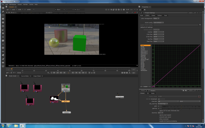
In VFX we were looking at layers and channels and how they can be useful.

Here is the original image-

layers-and-channels

Through Shuffle I separated the layers. Below is what they look like individually-

It was really useful to learn about this as it gave me a better understanding of what Nuke does with each editing technique.


1004:shape rendering

For the production class we were set more rendering work as homework. We had to render more complex shapes than the spheres

Here are the shapes below. The light source was indicated by the arrows.

I found it harder than the sphere to render as I got the brush settings wrong in my first attempt and also forgot to put a sold colour as the background.

Although the texture looks softer than it would have been if I’d done a base colour I think it shows the correct lighting pattern and the shadows have realistic weight and dispersion.

1001: Background Characters

After being properly set the task today I decided to move away from the design of Queen Elizabeth and look into other characters.

In a review it was mentioned I could look into historical context and I decided to add elements of the Spanish Armada.

Below is a sketch page where I focused designs for the Ladies in Waiting and the Duke of Medina-

ladiesinwaiting

I referenced the below images when creating the work-

I wanted to add humour to it so I drew the Duke in board shorts and the Ladies as secret service style body guards.

I then created a really rough comparison/ reference chart

allcharas

In class discussions it was also mentioned that the recreation of the sport didn’t have to be a complete adaptation of the way it’s seen on TV so I thought I could make the character lift something other than a dumbbell.

I found this image of a character lifting another-

tumblr_o0ippsnak41qjssm1o1_1280

And my first thought was to have Elizabeth lift one of her ladies in waiting-

titleimage

But then I thought I could visualize the Spanish defeat and have her lift the Duke-

lift

These are all still random ideas as I need to script and storyboard the piece, but while I don’t have a structure to stick to I’m able to come up with a wide range of ideas.

Texturing trials in Maya

I decided to try texturing the fruit piece.

I asked for help and managed to make a short tutorial for myself-

This meant I could start trialing basic textures.

I started with the bowls first as they’re white so I knew I couldn’t get the colour wrong. The picture also shows the text texture I put on the antlers to see if the material type was correct-

2016-11-22-6

Here are the texture choices I made for some of the fruit and the table. Unfortunately my laptop couldn’t handle the file size so I lost all the texture apart from the lemon, orange and furniture.

1003:Building model

I decided to start again with my building model and created the basic shape from a cube and a sphere combined together-

building-comparison

This design was the right shape but I didn’t half the sphere so the uv map was a mess-

2016-11-18

I then started again and following a review made the shapes a simple as possible-

I also did a lighting test to see if it was the right size and proportions to have the same shadows as the original-

buildinglightbelow2buildinglight1

I also started to model the pipe connection on the side of the building

2016-11-20.png

I also modelled a smaller building and started to think about the buildings composition.